How To Visualize Survey Results
Surveys are an important tool for collecting data and gaining insights into customer behavior and preferences. But once you’ve collected the data, what do you do with it? One of the most effective ways to make sense of survey data is to visualize it. Visualizing survey results can help you quickly identify patterns, trends, and correlations that may not be immediately obvious when looking at a spreadsheet.
Why Visualize Survey Results?
Visualizing survey results can help you uncover insights that you may not have noticed when looking at the raw data. It can also help you communicate your findings to stakeholders in a more effective way. Visuals are easier to understand than raw data, and they can help you make a more powerful case for your research findings.
Types of Visualizations
There are many different types of visualizations you can use to represent survey data. The type of visualization you choose will depend on the type of data you’re working with and the story you’re trying to tell. Here are some of the most common types of visualizations used to represent survey data:
Bar Charts
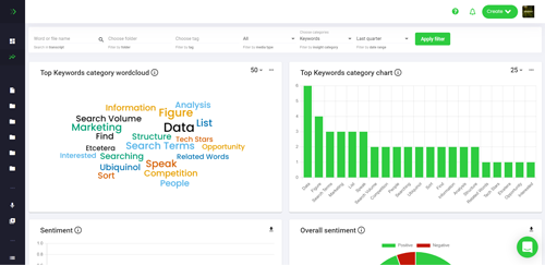
Bar charts are one of the most common types of visualizations used to represent survey data. They are used to compare values across different categories. For example, you could use a bar chart to compare the percentage of respondents who answered “yes” to a particular question across different age groups.
Pie Charts
Pie charts are used to represent the relative size of different categories. For example, you could use a pie chart to show the percentage of respondents who answered “yes” to a particular question.
Line Graphs
Line graphs are used to show changes in values over time. For example, you could use a line graph to show how the percentage of respondents who answered “yes” to a particular question changed over time.
Scatter Plots
Scatter plots are used to show the relationship between two variables. For example, you could use a scatter plot to show the relationship between the age of respondents and their satisfaction with a product.
Tips for Visualizing Survey Results
Visualizing survey results can be a powerful way to uncover insights and communicate your findings. Here are some tips to help you get the most out of your visualizations:
Choose the Right Visualization
The type of visualization you choose will depend on the type of data you’re working with and the story you’re trying to tell. Make sure you choose the right visualization for the job.
Keep it Simple
When it comes to visualizing survey results, less is more. Keep your visualizations simple and easy to understand. Avoid using too many colors or labels, as this can make your visualizations hard to read.
Focus on the Story
When creating visualizations, focus on the story you’re trying to tell. Make sure the data you’re visualizing is relevant to the story and that the visualization is helping to illustrate the point you’re trying to make.
Make it Interactive
Interactive visualizations can be a great way to engage your audience and help them explore the data in more depth. Consider adding interactive elements such as filters and drill-downs to your visualizations to make them more engaging.
Conclusion
Visualizing survey results can be a powerful way to uncover insights and communicate your findings. There are many different types of visualizations you can use to represent survey data, and it’s important to choose the right one for the job. Keep your visualizations simple and focus on the story you’re trying to tell. And don’t forget to make them interactive to engage your audience. With the right approach, visualizing survey results can help you make sense of your data and make a more powerful case for your research findings.
