How To Analyze Survey Data In Excel
Surveys are vital tools to collect data and information from a wide range of customers, employees, and stakeholders. Excel is a great tool to analyze survey data and visualize the results. This article will help you understand how to analyze survey data in Excel and make the most of the collected data.
Gather Your Data
The first step is to get all the survey data into Excel. Depending on the format of the survey, this can be done in several ways. If it is a paper survey, you will need to enter the data manually into an Excel spreadsheet. If the survey was administered electronically, you can export the data directly into an Excel spreadsheet.
Organize Your Data
Once the data is in Excel, the next step is to organize it. This includes sorting the data by the relevant information such as age, gender, or location. This will make it easier to find the data you need for analysis.
Analyze the Data
Once the data is organized, it is time to start analyzing it. Excel has several tools that can help you analyze survey data. These include pivot tables, charts, and graphs. Pivot tables are particularly useful for analyzing survey data because they allow you to quickly summarize and analyze the data.
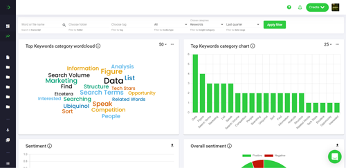
Visualize the Results
Once the survey data has been analyzed, it is time to visualize the results. Excel has a variety of tools that can help you do this. Charts and graphs are the most popular tools for visualizing survey data. They allow you to quickly and easily see the relationships between different variables.
Share the Results
The final step is to share the results of your survey analysis. Excel allows you to easily export your data and results to other applications such as PowerPoint or Word. This makes it easy to present your results to stakeholders, customers, or employees.
Conclusion
Analyzing survey data in Excel is a great way to make the most of the data you have collected. With the right tools and techniques, you can quickly and easily analyze and visualize the data. This will help you make better decisions and gain valuable insights from the survey data.
References
SurveyMonkey – Survey Data Analysis with Excel
Microsoft – Supercharge Excel Pivot Tables to Analyze Survey Data
Smartsheet – How to Analyze Survey Data in Excel
