How To Visualize Survey Data
Data visualization is an important tool for businesses, marketers, researchers, and analysts. It can help you gain insights into customer behavior, market trends, and product performance. Visualizing survey data can be a great way to make sense of large amounts of data and to communicate your findings to stakeholders. In this article, we’ll discuss how to visualize survey data, the benefits of doing so, and some tips for creating effective visualizations.
What Is Survey Data Visualization?
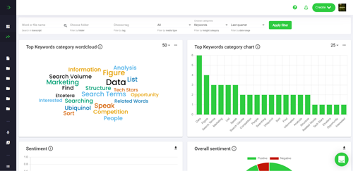
Survey data visualization is the process of creating visual representations of survey data. This can include charts, graphs, maps, and other types of visualizations. Visualizing survey data can help you quickly identify patterns, trends, and correlations in the data. It can also help you communicate your findings to stakeholders in a more effective and engaging way.
Benefits of Visualizing Survey Data
Visualizing survey data can help you gain insights into customer behavior, market trends, and product performance. It can also help you communicate your findings to stakeholders in a more effective and engaging way. Here are some of the benefits of visualizing survey data:
- It can help you quickly identify patterns and trends in the data.
- It can help you communicate your findings to stakeholders in a more effective and engaging way.
- It can help you identify correlations between different variables.
- It can help you identify outliers and anomalies in the data.
- It can help you identify relationships between different variables.
Tips for Visualizing Survey Data
Creating effective visualizations of survey data can be a challenge. Here are some tips to help you create effective visualizations of survey data:
- Choose the right type of visualization. Different types of visualizations are better suited for different types of data. For example, bar charts are better suited for categorical data, while scatter plots are better suited for numerical data.
- Keep it simple. Try to keep your visualizations as simple as possible. Too much detail can be overwhelming and can make it difficult to identify patterns and trends in the data.
- Use color wisely. Color can be a powerful tool for communicating information. Use color to highlight important points or to draw attention to certain elements of the visualization.
- Label your visualizations. Labeling your visualizations can help you communicate your findings more effectively. Make sure to include labels for each axis and any other important elements of the visualization.
- Include a legend. Including a legend can help you communicate the meaning of the visualization more effectively. Make sure to include a legend for any colors or symbols used in the visualization.
Conclusion
Visualizing survey data can be a great way to make sense of large amounts of data and to communicate your findings to stakeholders. It can help you quickly identify patterns, trends, and correlations in the data. By following the tips outlined in this article, you can create effective visualizations of survey data that will help you gain insights into customer behavior, market trends, and product performance.


