How To Visualize Big Data
Big data is a term used to describe large and complex datasets that require advanced analytics to uncover insights. It’s a hot topic in the business world, and understanding how to effectively visualize big data is essential for any organization looking to make the most of their data. Visualizing big data can help organizations gain valuable insights into customer behavior, market trends, and more. In this article, we’ll discuss the importance of visualizing big data, the different types of visualizations available, and how to create effective visualizations.
Why Visualize Big Data?
Visualizing big data is important because it allows organizations to quickly and easily identify patterns and trends in their data. By visualizing data, organizations can gain insights into customer behavior, market trends, and more. Visualizing data can also help organizations make better decisions, as it allows them to quickly identify areas of opportunity and potential risks.
Types of Visualizations
There are many different types of visualizations available for big data. Some of the most popular types of visualizations include:
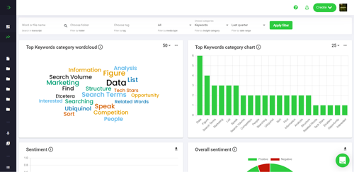
- Bar Charts: Bar charts are one of the most common types of visualizations used to represent big data. They are used to compare different values or categories. Bar charts are often used to compare sales figures, customer demographics, and more.
- Line Graphs: Line graphs are used to show changes over time. They are often used to track customer behavior, market trends, and more.
- Pie Charts: Pie charts are used to represent the relative size of different categories. They are often used to compare sales figures, customer demographics, and more.
- Heat Maps: Heat maps are used to represent the intensity of a particular value or category. They are often used to compare customer behavior, market trends, and more.
- Scatter Plots: Scatter plots are used to show the relationship between two variables. They are often used to compare customer behavior, market trends, and more.
- Bubble Charts: Bubble charts are used to represent the relative size of different categories. They are often used to compare customer behavior, market trends, and more.
- 3D Charts: 3D charts are used to represent the relative size of different categories in three dimensions. They are often used to compare customer behavior, market trends, and more.
Creating Effective Visualizations
Creating effective visualizations for big data requires a few key steps. First, you need to decide what type of visualization you want to create. Different types of visualizations are better suited for different types of data. For example, bar charts are better suited for comparing different categories, while line graphs are better suited for tracking changes over time.
Once you’ve decided on the type of visualization, you need to decide what data you want to visualize. You should focus on the most important data points and avoid including too much data, as this can make the visualization cluttered and difficult to interpret.
Finally, you need to decide how you want to present the data. You should choose colors and fonts that are easy to read, and make sure the visualization is easy to understand.
Conclusion
Visualizing big data is an important part of any organization’s data analysis process. By visualizing data, organizations can gain valuable insights into customer behavior, market trends, and more. There are many different types of visualizations available, and it’s important to choose the right type for your data. Creating effective visualizations requires careful consideration of the data points you want to include, the type of visualization you want to create, and how you want to present the data. With the right approach, visualizing big data can help organizations make better decisions and gain valuable insights.
