Introduction
Storytelling with data visualization is an essential skill for any marketer, business analyst, data scientist, or academic researcher. It's a powerful tool that can help you make sense of complex data and communicate your findings to others. Visual storytelling can be used to make data more accessible, easier to digest, and more convincing. Data visualization allows you to present your data in an engaging and interactive way, allowing you to capture your audience’s attention and draw them into your story.
Data visualization has become increasingly popular over the past decade, with more and more organizations using it for data analysis, market research, and customer experience management. In this blog post, we'll discuss the importance of storytelling with data visualization and how you can use it to make your data more engaging and persuasive. We'll also look at some of the best practices for creating effective data visualizations that will help you communicate your message more effectively.
The Benefits of Storytelling with Data Visualization
Data visualization can be an invaluable tool for business owners, marketers, market researchers, and data scientists. It can help you quickly identify trends, uncover correlations, and make sense of complex data. But beyond that, data visualization can also be used to tell stories.
Storytelling with data visualization allows you to communicate your message in a more engaging and interactive way. It can make data more accessible and easier to understand, and it can help you make more convincing arguments. It can also help you to identify patterns and correlations that may have otherwise gone unnoticed.
Data visualization can also help you to communicate complex concepts more effectively. By using visuals, you can make abstract ideas more concrete, which can help to make them easier for your audience to understand.
Best Practices for Storytelling with Data Visualization
Creating effective data visualizations can be a challenge, especially if you're new to the field. Here are some best practices to help you get started:
Start with a clear goal
Before you start creating your data visualization, take some time to think about your goal. What do you want to accomplish with your visualization? Do you want to illustrate a trend, uncover a correlation, or make a comparison? Knowing your goal will help you stay focused and ensure that your visualization is effective.
Choose the right visualization
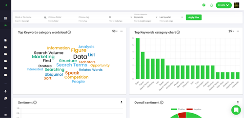
Not all data visualizations are created equal. Different types of visualizations are better suited for different types of data, so it's important to choose the right visualization for your data. For example, if you're trying to illustrate a trend over time, a line graph may be a better choice than a bar graph.
Keep it simple
When it comes to data visualization, less is often more. Too much clutter can make it difficult to focus on the data, so be sure to keep your visualizations simple and easy to understand.
Focus on the data
The most important part of any data visualization is the data itself. Your visualizations should be focused on the data and not on aesthetics. That means any design elements should be used to enhance the data, not distract from it.
Conclusion
Storytelling with data visualization is an important skill for any marketer, business analyst, data scientist, or academic researcher. It can help you make sense of complex data, communicate your findings to others, and make more convincing arguments. Data visualization can also help you identify patterns and correlations that may have otherwise gone unnoticed.
By following the best practices outlined in this blog post, you can create effective data visualizations that will help you communicate your message more effectively. So if you're looking to make your data more accessible, easier to understand, and more persuasive, storytelling with data visualization is the way to go.