
What's New In Speak - April 2024
Interested in What's New In Speak February 2024? Check out this post for all the new updates available for you in Speak today!
In this video, I'm going to show you how you can actually use the sentiment analysis in both audio and video files. So starting from the login screen, all I have to do is sign in, taken to the dashboard and as always I'm sort of choosing the video and on let's see if I can find a little bit longer video. This is awesome. Actually this is a video of a great friend who left some feedback for us and what I can actually do. We can see the insights here, but now I can go into the area. That is labelled sentiment. And what we're actually seeing is a chart, and in this chart, we can actually see sort of the breakdown of sentiment over time.
And then if you see I can hover, you'll actually see the areas that are positive an negative, so you know really we can start to see some peaks of what it is. I might have to zoom in to get that and to show you the zoom in all I have to do is go here and then I can start to see. Basically, starting the things that are starting to be more positive or negative, so maybe there's something you know it wasn't really committed.
Could start to sort of zoom in on different areas and actually see that throughout the video, and then I can drag back across here and actually bring it all the way out. So really good for identifying you know moments of positively and negatively. Throughout the video. The next step is actually just being able to let you click and then you will navigate through to that specific moment and then the other part here is actually the score area and what you can do is actually see how we're measuring the sentiment.
And basically what we see is little sad faces for more negative sentiment. And then if I sort here, you can actually see more positive faces. So wow, this is cool and it brought analytics is good. You know we started to see some of the happier sentences. And then if I go back this way, actually go by order and then this is now the most negative ones. So I you know some swear words.
Sorry for anyone watching this, but this is really the way that we're using sentiment. For audio and video and you can see the video start to populate here and some stuff that he's looking at in our own app and the next part again will be the clickable piece. So as I go and see.
Oh not the greatest picture I can click and it will navigate through to that specific moment and that will allow you to then jump around much quicker into positive and negative moments in the video, so I hope you find this valuable. We're going to increasingly improve the sentiment analysis algorithms so that they are more accurate for you and then provide a lot more. New once in the way that you can navigate through the video and audio files that you have as well as the text notes that I will cover in another video. Thank you so much.
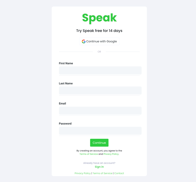
To start your transcription and analysis, you first need to create a Speak account. No worries, this is super easy to do!
Get a 7-day trial with 30 minutes of free English audio and video transcription included when you sign up for Speak.
To sign up for Speak and start using Speak Magic Prompts, visit the Speak app register page here.
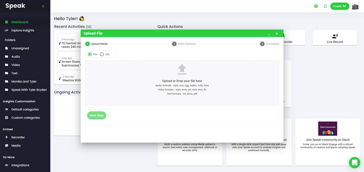
We typically recommend MP4s for video or MP3s for audio.
However, we accept a range of audio, video and text file types.
You can upload your file for transcription in several ways using Speak:
You can also upload CSVs of text files or audio and video files. You can learn more about CSV uploads and download Speak-compatible CSVs here.
With the CSVs, you can upload anything from dozens of YouTube videos to thousands of Interview Data.
You can also upload media to Speak through a publicly available URL.
As long as the file type extension is available at the end of the URL you will have no problem importing your recording for automatic transcription and analysis.
Speak is compatible with YouTube videos. All you have to do is copy the URL of the YouTube video (for example, https://www.youtube.com/watch?v=qKfcLcHeivc).
Speak will automatically find the file, calculate the length, and import the video.
If using YouTube videos, please make sure you use the full link and not the shortened YouTube snippet. Additionally, make sure you remove the channel name from the URL.
As mentioned, Speak also contains a range of integrations for Zoom, Zapier, Vimeo and more that will help you automatically transcribe your media.
This library of integrations continues to grow! Have a request? Feel encouraged to send us a message.
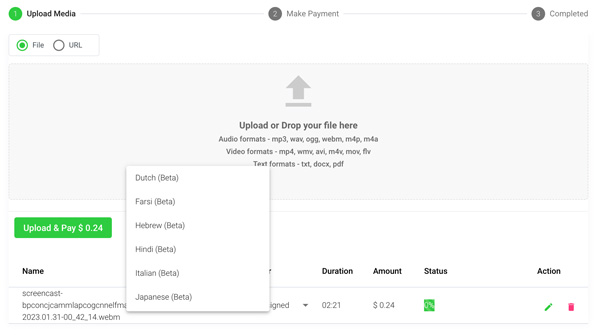
Once you have your file(s) ready and load it into Speak, it will automatically calculate the total cost (you get 30 minutes of audio and video free in the 7-day trial - take advantage of it!).
If you are uploading text data into Speak, you do not currently have to pay any cost. Only the Speak Magic Prompts analysis would create a fee which will be detailed below.
Once you go over your 30 minutes or need to use Speak Magic Prompts, you can pay by subscribing to a personalized plan using our real-time calculator.
You can also add a balance or pay for uploads and analysis without a plan using your credit card.
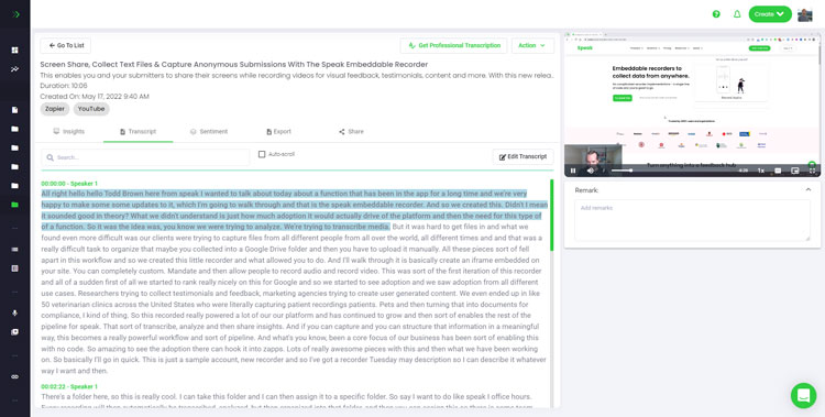
If you are uploading audio and video, our automated transcription software will prepare your transcript quickly. Once completed, you will get an email notification that your transcript is complete. That email will contain a link back to the file so you can access the interactive media player with the transcript, analysis, and export formats ready for you.
If you are importing CSVs or uploading text files Speak will generally analyze the information much more quickly.

Speak is capable of analyzing both individual files and entire folders of data.
When you are viewing any individual file in Speak, all you have to do is click on the "Prompts" button.
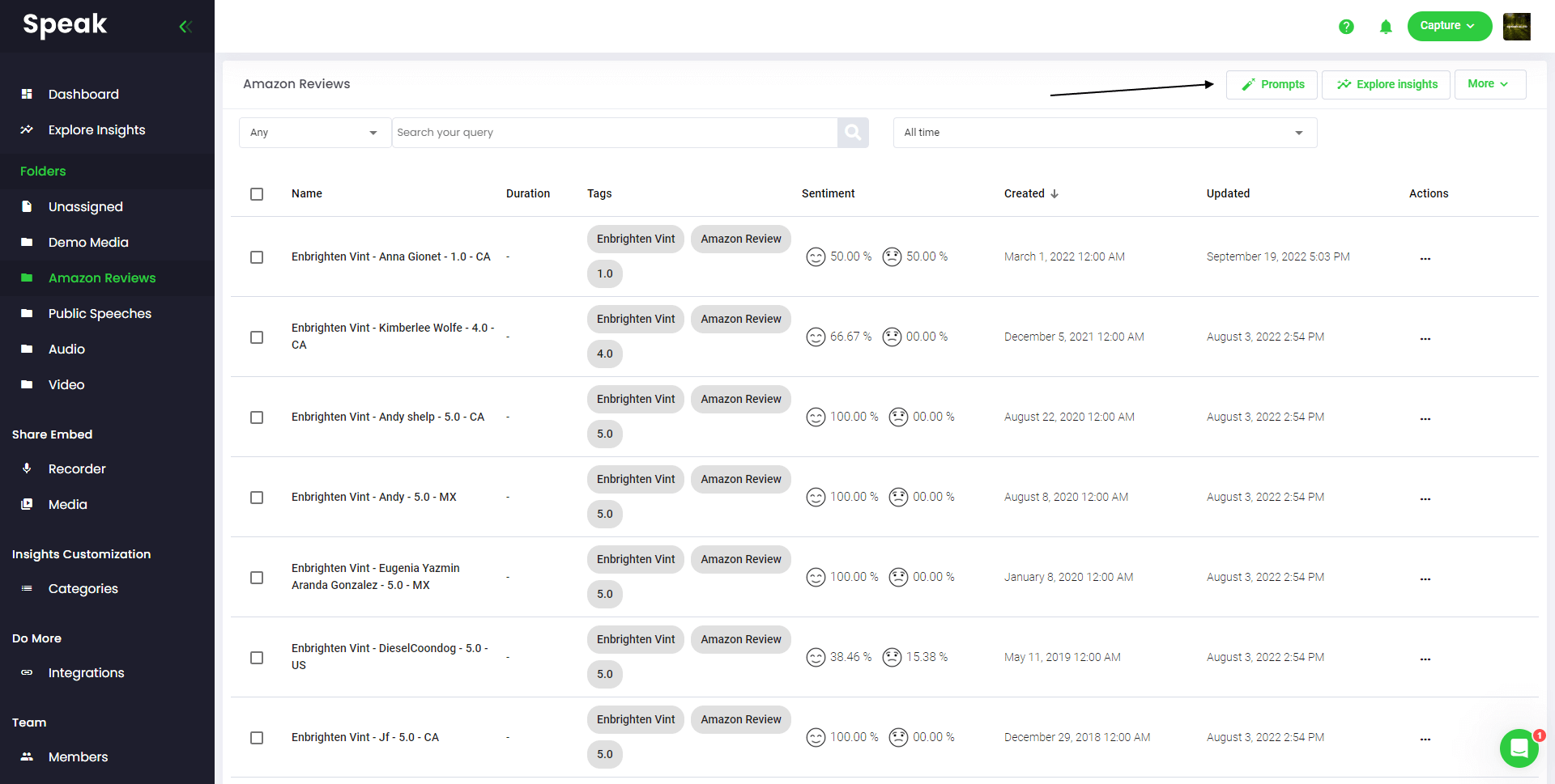
If you want to analyze many files, all you have to do is add the files you want to analyze into a folder within Speak.
You can do that by adding new files into Speak or you can organize your current files into your desired folder with the software's easy editing functionality.
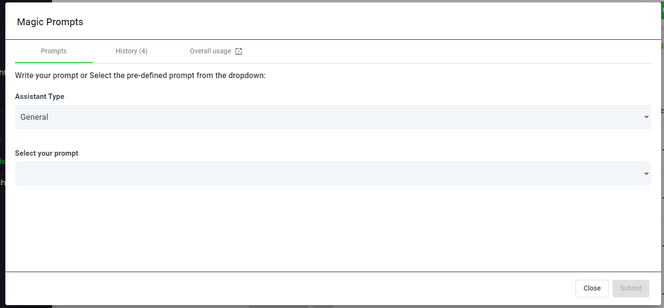
Speak Magic Prompts leverage innovation in artificial intelligence models often referred to as "generative AI".
These models have analyzed huge amounts of data from across the internet to gain an understanding of language.
With that understanding, these "large language models" are capable of performing mind-bending tasks!
With Speak Magic Prompts, you can now perform those tasks on the audio, video and text data in your Speak account.

To help you get better results from Speak Magic Prompts, Speak has introduced "Assistant Type".
These assistant types pre-set and provide context to the prompt engine for more concise, meaningful outputs based on your needs.
To begin, we have included:
Choose the most relevant assistant type from the dropdown.

Here are some examples prompts that you can apply to any file right now:
A modal will pop up so you can use the suggested prompts we shared above to instantly and magically get your answers.
If you have your own prompts you want to create, select "Custom Prompt" from the dropdown and another text box will open where you can ask anything you want of your data!
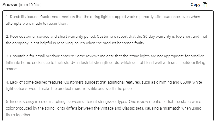
Speak will generate a concise response for you in a text box below the prompt selection dropdown.
In this example, we ask to analyze all the Interview Data in the folder at once for the top product dissatisfiers.
You can easily copy that response for your presentations, content, emails, team members and more!
Our team at Speak Ai continues to optimize the pricing for Magic Prompts and Speak as a whole.
Right now, anyone in the 7-day trial of Speak gets 100,000 characters included in their account.
If you need more characters, you can easily include Speak Magic Prompts in your plan when you create a subscription.
You can also upgrade the number of characters in your account if you already have a subscription.
Both options are available on the subscription page.
Alternatively, you can use Speak Magic Prompts by adding a balance to your account. The balance will be used as you analyze characters.
Here at Speak, we've made it incredibly easy to personalize your subscription.
Once you sign-up, just visit our custom plan builder and select the media volume, team size, and features you want to get a plan that fits your needs.
No more rigid plans. Upgrade, downgrade or cancel at any time.
When you subscribe, you will also get a free premium add-on for three months!
That means you save up to $50 USD per month and $150 USD in total.
Once you subscribe to a plan, all you have to do is send us a live chat with your selected premium add-on from the list below:
We will put the add-on live in your account free of charge!
What are you waiting for?
If you have friends, peers and followers interested in using our platform, you can earn real monthly money.
You will get paid a percentage of all sales whether the customers you refer to pay for a plan, automatically transcribe media or leverage professional transcription services.
Use this link to become an official Speak affiliate.
It would be an honour to personally jump on an introductory call with you to make sure you are set up for success.
Just use our Calendly link to find a time that works well for you. We look forward to meeting you!

Interested in What's New In Speak February 2024? Check out this post for all the new updates available for you in Speak today!

Interested in What's New In Speak February 2024? Check out this post for all the new updates available for you in Speak today!
Use AI, intelligent search and data visualization to unlock meaningful insights from audio, video & text.

Powered by Speak Ai Inc. Made in Canada with
Use Speak's powerful AI to transcribe, analyze, automate and produce incredible insights for you and your team.