How To Visualize Text Data
Text data is an important part of any business, from customer feedback to market research. But it can be hard to make sense of all the information without visualizing it. Visualizing text data can help you better understand the data and make decisions based on it. In this article, we’ll discuss how to visualize text data and the different tools and techniques you can use to do it.
What Is Text Data?
Text data is any data that is stored in a textual format. This includes emails, customer feedback, survey responses, and more. Text data can be difficult to analyze because it’s not in a numerical format. Visualizing text data can help you make sense of it and draw insights from it.
Why Visualize Text Data?
Visualizing text data can help you better understand the data and draw insights from it. It can also help you identify patterns and trends that may not be obvious when looking at the data in its raw form. Visualizing text data can also help you communicate your findings to others more effectively.
Tools and Techniques for Visualizing Text Data
There are several tools and techniques you can use to visualize text data. Here are some of the most popular ones:
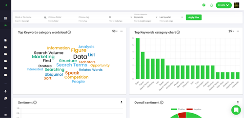
Word Clouds
Word clouds are a popular way to visualize text data. They show the most commonly used words in a given text. Word clouds can be used to quickly identify the most important words in a text and can be used to compare different texts.
Text Analysis
Text analysis is a technique used to analyze text data. It involves using algorithms to identify patterns and trends in the data. Text analysis can be used to identify topics, sentiment, and other insights from text data.
Sentiment Analysis
Sentiment analysis is a technique used to identify the sentiment of text data. It involves using algorithms to identify whether a text is positive, negative, or neutral. Sentiment analysis can be used to identify customer sentiment about a product or service.
Topic Modeling
Topic modeling is a technique used to identify topics in text data. It involves using algorithms to identify the topics in a text. Topic modeling can be used to identify the topics in customer feedback or survey responses.
Network Analysis
Network analysis is a technique used to identify relationships between entities in text data. It involves using algorithms to identify relationships between entities such as people, organizations, and topics. Network analysis can be used to identify relationships between customers or topics in customer feedback.
Conclusion
Visualizing text data can help you better understand the data and draw insights from it. There are several tools and techniques you can use to visualize text data, including word clouds, text analysis, sentiment analysis, topic modeling, and network analysis. Visualizing text data can help you make better decisions and communicate your findings to others more effectively.
How To Use The Best Large Language Models For Language Analysis With Speak
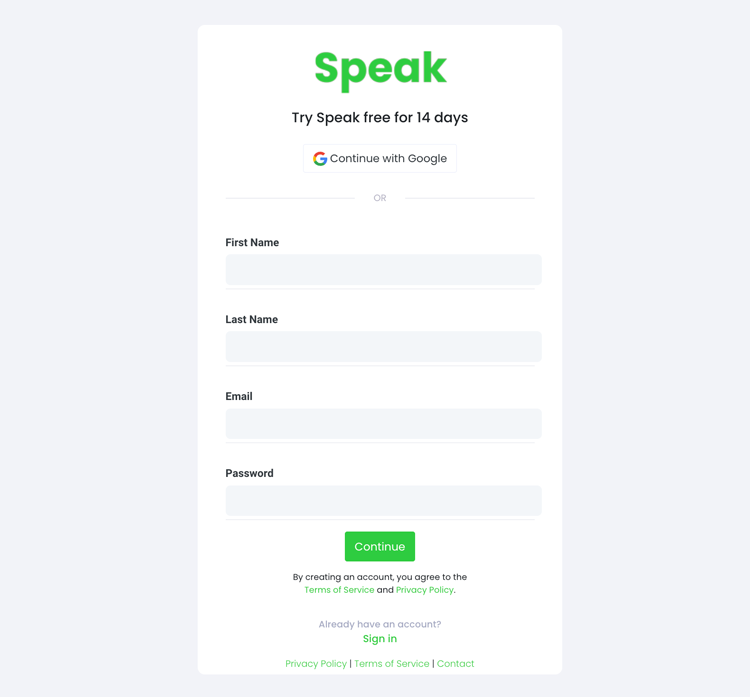
Step 1: Create Your Speak Account
To start your transcription and analysis, you first need to create a Speak account. No worries, this is super easy to do!
Get a 7-day trial with 30 minutes of free English audio and video transcription included when you sign up for Speak.
To sign up for Speak and start using Speak Magic Prompts, visit the Speak app register page here.
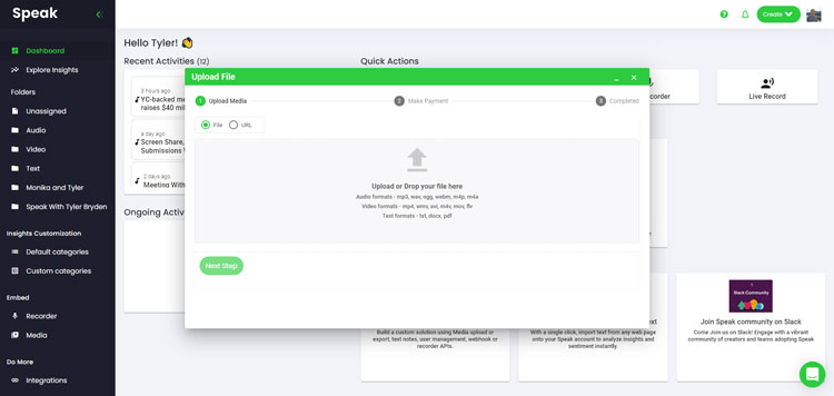
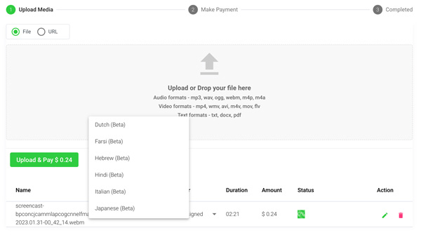
Step 2: Upload Your Language Analysis Data
We typically recommend MP4s for video or MP3s for audio.
However, we accept a range of audio, video and text file types.
You can upload your file for transcription in several ways using Speak:
Accepted Audio File Types
- MP3
- M4A
- WAV
- OGG
- WEBM
- M4P
Accepted Video File Types
- MP4
- M4V
- WMV
- AVI
- MOV
- FLV
Accepted Text File Types
- TXT
- Word Doc
CSV Imports
You can also upload CSVs of text files or audio and video files. You can learn more about CSV uploads and download Speak-compatible CSVs here.
With the CSVs, you can upload anything from dozens of YouTube videos to thousands of Interview Data.
Publicly Available URLs
You can also upload media to Speak through a publicly available URL.
As long as the file type extension is available at the end of the URL you will have no problem importing your recording for automatic transcription and analysis.
YouTube URLs
Speak is compatible with YouTube videos. All you have to do is copy the URL of the YouTube video (for example, https://www.youtube.com/watch?v=qKfcLcHeivc).
Speak will automatically find the file, calculate the length, and import the video.
If using YouTube videos, please make sure you use the full link and not the shortened YouTube snippet. Additionally, make sure you remove the channel name from the URL.
Speak Integrations
As mentioned, Speak also contains a range of integrations for Zoom, Zapier, Vimeo and more that will help you automatically transcribe your media.
This library of integrations continues to grow! Have a request? Feel encouraged to send us a message.
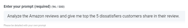
Step 3: Calculate and Pay the Total Automatically
Once you have your file(s) ready and load it into Speak, it will automatically calculate the total cost (you get 30 minutes of audio and video free in the 7-day trial - take advantage of it!).
If you are uploading text data into Speak, you do not currently have to pay any cost. Only the Speak Magic Prompts analysis would create a fee which will be detailed below.
Once you go over your 30 minutes or need to use Speak Magic Prompts, you can pay by subscribing to a personalized plan using our real-time calculator.
You can also add a balance or pay for uploads and analysis without a plan using your credit card.
![]()
Step 4: Wait for Speak to Analyze Your Language Analysis Data
If you are uploading audio and video, our automated transcription software will prepare your transcript quickly. Once completed, you will get an email notification that your transcript is complete. That email will contain a link back to the file so you can access the interactive media player with the transcript, analysis, and export formats ready for you.
If you are importing CSVs or uploading text files Speak will generally analyze the information much more quickly.
Step 5: Visit Your File Or Folder
Speak is capable of analyzing both individual files and entire folders of data.
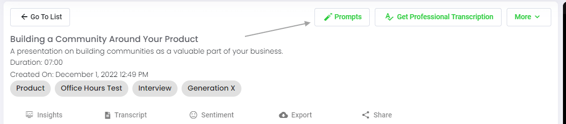
When you are viewing any individual file in Speak, all you have to do is click on the "Prompts" button.
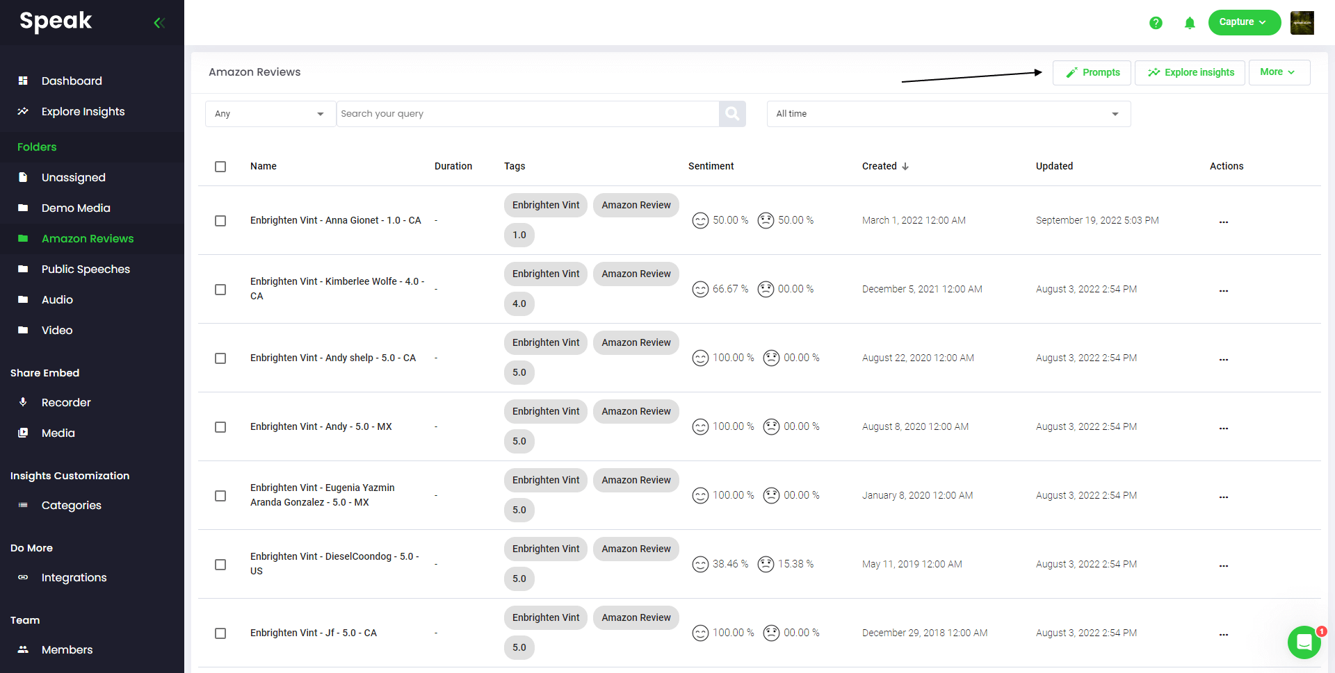
If you want to analyze many files, all you have to do is add the files you want to analyze into a folder within Speak.
You can do that by adding new files into Speak or you can organize your current files into your desired folder with the software's easy editing functionality.
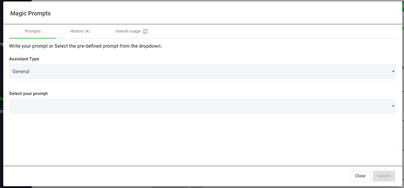
Step 6: Select Speak Magic Prompts To Analyze Your Language Analysis Data
What Are Magic Prompts?
Speak Magic Prompts leverage innovation in artificial intelligence models often referred to as "generative AI".
These models have analyzed huge amounts of data from across the internet to gain an understanding of language.
With that understanding, these "large language models" are capable of performing mind-bending tasks!
With Speak Magic Prompts, you can now perform those tasks on the audio, video and text data in your Speak account.
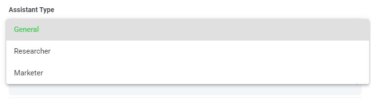
Step 7: Select Your Assistant Type
To help you get better results from Speak Magic Prompts, Speak has introduced "Assistant Type".
These assistant types pre-set and provide context to the prompt engine for more concise, meaningful outputs based on your needs.
To begin, we have included:
- General
- Researcher
- Marketer
Choose the most relevant assistant type from the dropdown.
Step 8: Create Or Select Your Desired Prompt
Here are some examples prompts that you can apply to any file right now:
- Create a SWOT Analysis
- Give me the top action items
- Create a bullet point list summary
- Tell me the key issues that were left unresolved
- Tell me what questions were asked
- Create Your Own Custom Prompts
A modal will pop up so you can use the suggested prompts we shared above to instantly and magically get your answers.
If you have your own prompts you want to create, select "Custom Prompt" from the dropdown and another text box will open where you can ask anything you want of your data!
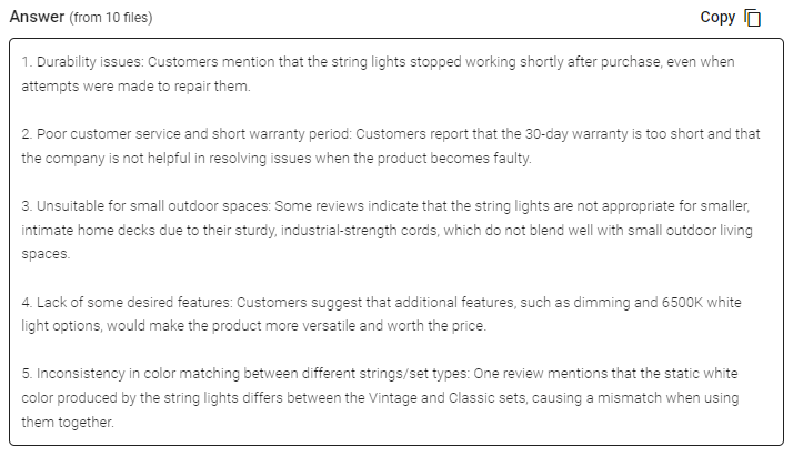
Step 9: Review & Share Responses
Speak will generate a concise response for you in a text box below the prompt selection dropdown.
In this example, we ask to analyze all the Interview Data in the folder at once for the top product dissatisfiers.
You can easily copy that response for your presentations, content, emails, team members and more!
Speak Magic Prompts As ChatGPT For Language Analysis Data Pricing
Our team at Speak Ai continues to optimize the pricing for Magic Prompts and Speak as a whole.
Right now, anyone in the 7-day trial of Speak gets 100,000 characters included in their account.
If you need more characters, you can easily include Speak Magic Prompts in your plan when you create a subscription.
You can also upgrade the number of characters in your account if you already have a subscription.
Both options are available on the subscription page.
Alternatively, you can use Speak Magic Prompts by adding a balance to your account. The balance will be used as you analyze characters.
Completely Personalize Your Plan 📝
Here at Speak, we've made it incredibly easy to personalize your subscription.
Once you sign-up, just visit our custom plan builder and select the media volume, team size, and features you want to get a plan that fits your needs.
No more rigid plans. Upgrade, downgrade or cancel at any time.
Claim Your Special Offer 🎁
When you subscribe, you will also get a free premium add-on for three months!
That means you save up to $50 USD per month and $150 USD in total.
Once you subscribe to a plan, all you have to do is send us a live chat with your selected premium add-on from the list below:
- Premium Export Options (Word, CSV & More)
- Custom Categories & Insights
- Bulk Editing & Data Organization
- Recorder Customization (Branding, Input & More)
- Media Player Customization
- Shareable Media Libraries
We will put the add-on live in your account free of charge!
What are you waiting for?
Refer Others & Earn Real Money 💸
If you have friends, peers and followers interested in using our platform, you can earn real monthly money.
You will get paid a percentage of all sales whether the customers you refer to pay for a plan, automatically transcribe media or leverage professional transcription services.
Use this link to become an official Speak affiliate.
Check Out Our Dedicated Resources📚
Book A Free Implementation Session 🤝
It would be an honour to personally jump on an introductory call with you to make sure you are set up for success.
Just use our Calendly link to find a time that works well for you. We look forward to meeting you!
