Updates
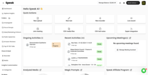
What's New In Speak - April 2024
Interested in What's New In Speak February 2024? Check out this post for all the new updates available for you in Speak today!
Data is not always numerical values that individually do not make sense. With the proper visualization tools in your corner, you can use data to inspire, bring out the best in people, and improve your business. That’s why we made a list of the top data visualization examples to give you a clear picture of what we are talking about.
Since the onset of the Global Pandemic, Speak Ai has witnessed an increasing number of users, especially experts who want help in data visualization projects. That said, we compiled a list of the top data visualization examples that will give you an idea of what these tools can do for you.
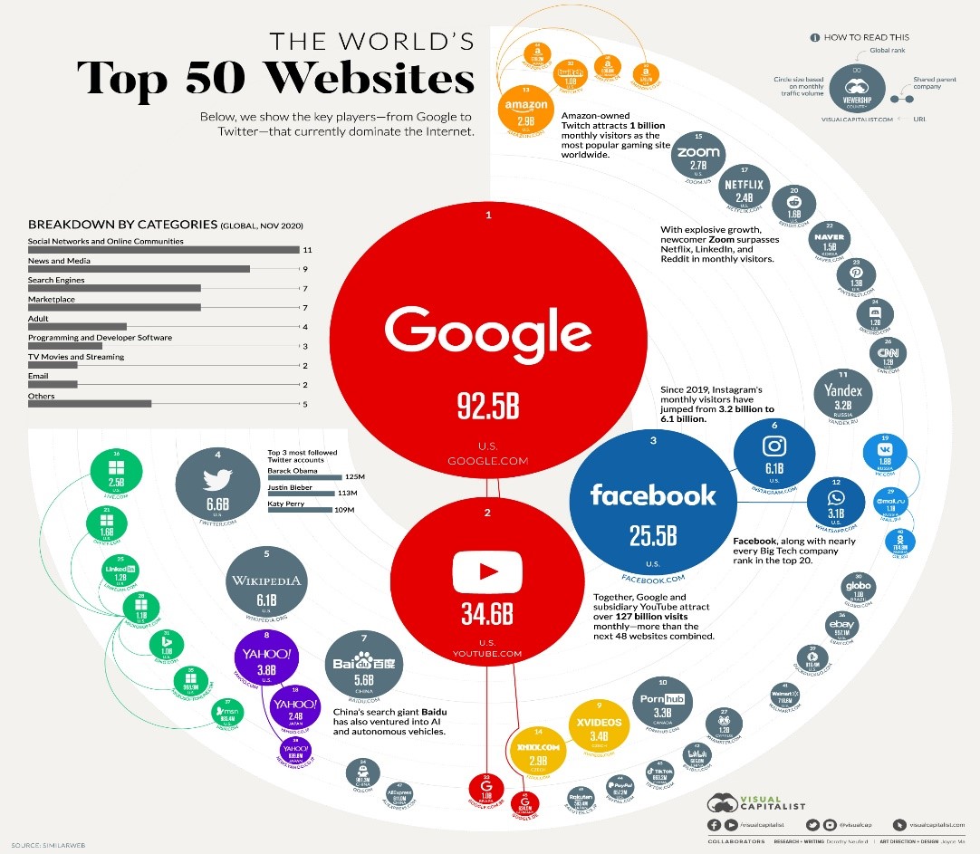
Those who spend countless hours online probably understand this visual representation better than others. But if you’ve ever used any device to get online, chances are you were looking for one of the websites listed above. Only a handful of websites have almost unmatched dominance.
The top highly-ranked websites are Google, YouTube, and Facebook. In fact, as we speak, you are probably on Google right now. That’s how dominant this search engine is. However, the data that gives you this visual effect isn’t appealing. And probably not everyone can understand such raw data. Thankfully, with the right tool, you can create this data visualization example and have your presentation ready on time.
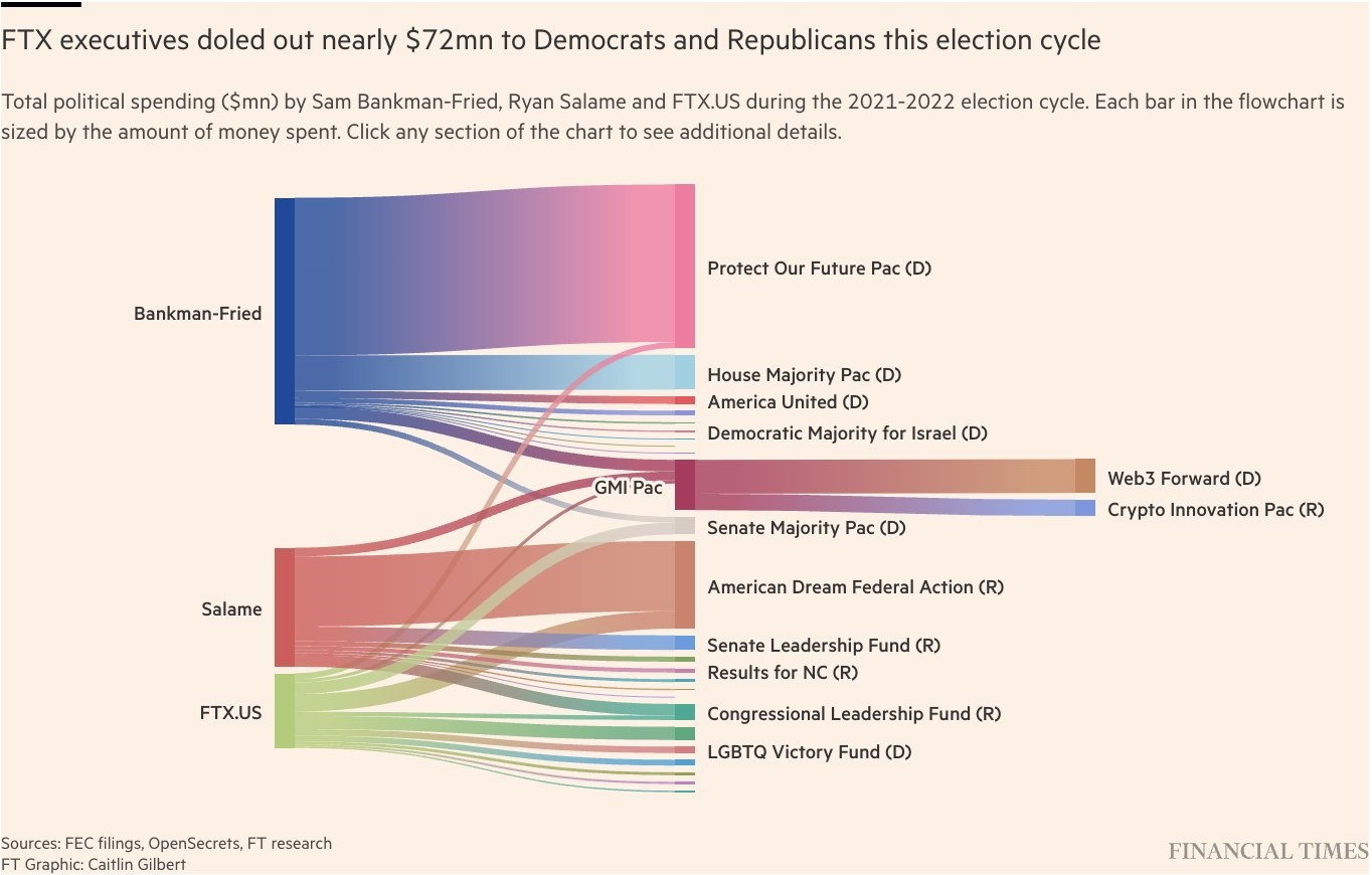
Here’s an interesting data visualization example that will likely blow your mind. Have you ever heard of FTX? I’m sure you have. It’s probably the most talked-over news this year and has had a catastrophic effect on those involved. FTX is a cryptocurrency exchange platform and company that Sam Bankman-Fried ran. In 2022, this company filed for bankruptcy with billions of dollars worth of cryptocurrencies from their users. To cut a long story short, the company is now under investigation, and the millions of users on this platform might not recover their cash.
The same company was financing the US elections, and this visual representation example highlights the millions of dollars that Sam spent during the 2021-2022 US elections. Sam Bankman-Fried, SBF, was the top donor for the Democrat cycle. Some speculate that’s why he was able to misappropriate people’s funds even with the strict regulations around crypto.
In a few minutes of looking at this data visualization example, you can easily understand the magnitude of what is currently happening to FTX, the SEC, and the US government.
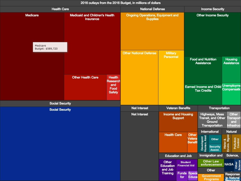
Here’s another data visualization example; the budget presentation of 2016 by the Obama administration. Most governments, especially the US, are notorious for creating tough-to-understand budget plans. Thankfully, the White House made this data representation during Obama’s presidency. The presentation visually breaks down the budget for 2016 and helps to put the government programs in context.
What sets this visualization apart from the rest is the delivery method. Granted, it’s not the clearest innovative treemap, but it’s a step for the US government in the right direction.
The key is that a significant world power government adopted an interactive data visualization to communicate to taxpayers where the tax dollar will be used. This complicated, sensitive topic was simplified with a straightforward visualization.
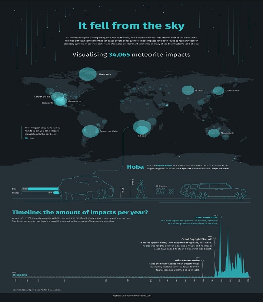
A UK designer created this infographic, representing 34,000 meteorites already fallen on the earth. It’s one of the best data visualization examples we’ve come across. To be more specific, this infographic gives you a clear picture of the year each meteorite hit the earth and the exact location. Additionally, the representation shows any spikes recorded while simultaneously comparing the sizes of the largest ever-recorded meteorite.
Meteorites have already hit almost all parts of the earth. However, some areas seem unscathed. This phenomenon could likely be connected to the earth’s magnetic fields. But who knows! Little research has been done along these lines, but we expect a more data-driven hypothesis in the future, thanks to technological advancement. If you have a knack for meteorites and space, you can always check out NASA’s official website for updates on that subject. NASA tries to stay ahead of any space exploration and posts it on its official site for the audience and any enthusiast.
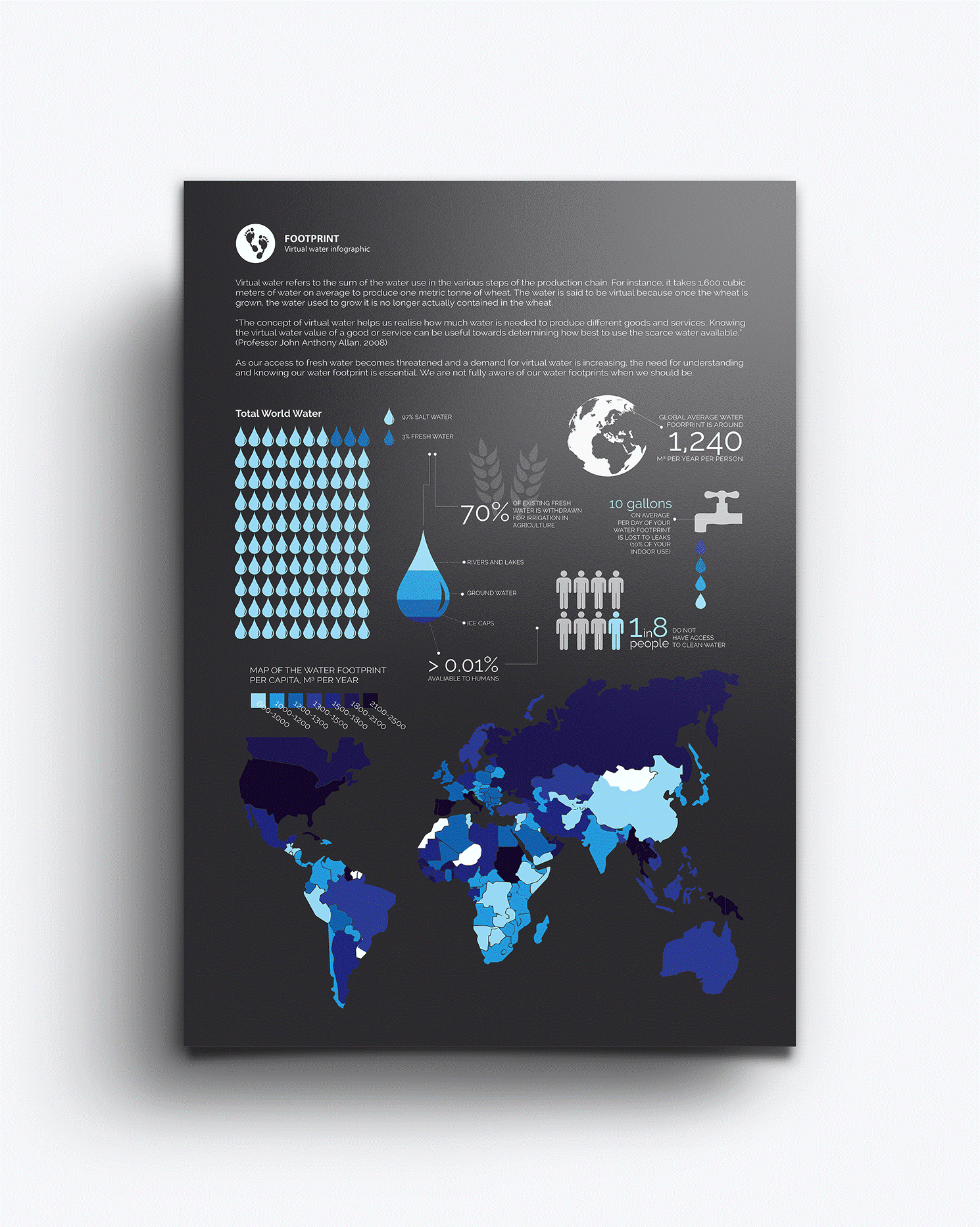
This data visualization example represents the water consumption required for specific food kinds. And then the second representation shows the available water resources worldwide, including a map footprint per year. Additionally, this example highlights the availability of clean water to people. This visual image shows how much water is needed per plant and the scarcity of it in the world.
The simple, straightforward answer is yes, you do. As you can see from the data visualization examples above, each image is easy to interpret, making it the perfect choice for presentation to various audiences. The idea of taking data is to prompt data-driven decisions, which can only be done if the audience understands what you are presenting.
Otherwise, the data collected is raw, unstructured, or structured but hard to interpret; it won’t lead to any action. As a matter of fact, unstructured data that is obviously not organized will only deter your audience from the project. That is why it’s best to take your time and find the ideal data visualization tools for your project and convert your work into something the whole world can understand.
Take a page off the Obama administration and how they handled their budget presentation to the taxpayers. Undoubtedly, that must’ve garnered a lot of positive feedback from the general public since he is one of the few presidents even to consider a visual representation of the budget. That will go down in history as Obama’s legacy.
That said, Speak Ai offers top-notch data visualization tools to smoothen your work process. More importantly, Speak Ai has an Ai word cloud generator that works in seconds.
Interested in What's New In Speak February 2024? Check out this post for all the new updates available for you in Speak today!
Interested in What's New In Speak February 2024? Check out this post for all the new updates available for you in Speak today!
Interested in What's New In Speak February 2024? Check out this post for all the new updates available for you in Speak today!

Thank you for continuing to be part of this journey - it means the world to us. Below is a summary of our 2023 at
Interested in The Best Executive Research Firms? Check out the dedicated article the Speak Ai team put together on The Best Executive Research Firms to learn more.
Interested in The Best Consumer Research Firms? Check out the dedicated article the Speak Ai team put together on The Best Consumer Research Firms to learn more.
Powered by Speak Ai Inc. Made in Canada with 